Tips and Tricks For Designing Custom Signs
When creating custom signs for promoting your business, you should always make them easy to read and understand. Some potential customers may pass by many businesses while running errands, so you want to make sure your outdoor signs catch their attention and make a lasting impact. The following sign design tips and tricks will help you design attractive custom signs that won't let your message go unnoticed.
Keep Location In Mind
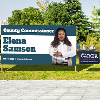
The placement of your custom signs will determine what color combinations and fonts you need to use to reach the largest audience. If your business is near a busy road, the design should be eye-catching yet simple enough to read quickly by passing drivers. Using large, bold fonts and only a few words is best for outdoor signs. Graphics should be limited to only one or two clear images. You may want to try out a few different sizes of signs and designs to see what looks best from a distance. Outdoor signs should be placed in easy to see locations and not around other advertising clutter. As for indoor signs, place them near the front of the store, counter, or near the area of a promoted product to help remind customers of upcoming specials or your current sale or promotion. You are safe to use more words and neutral colors since the customer is seeing the sign up close and in a lighted area.
Control Your Color Combinations
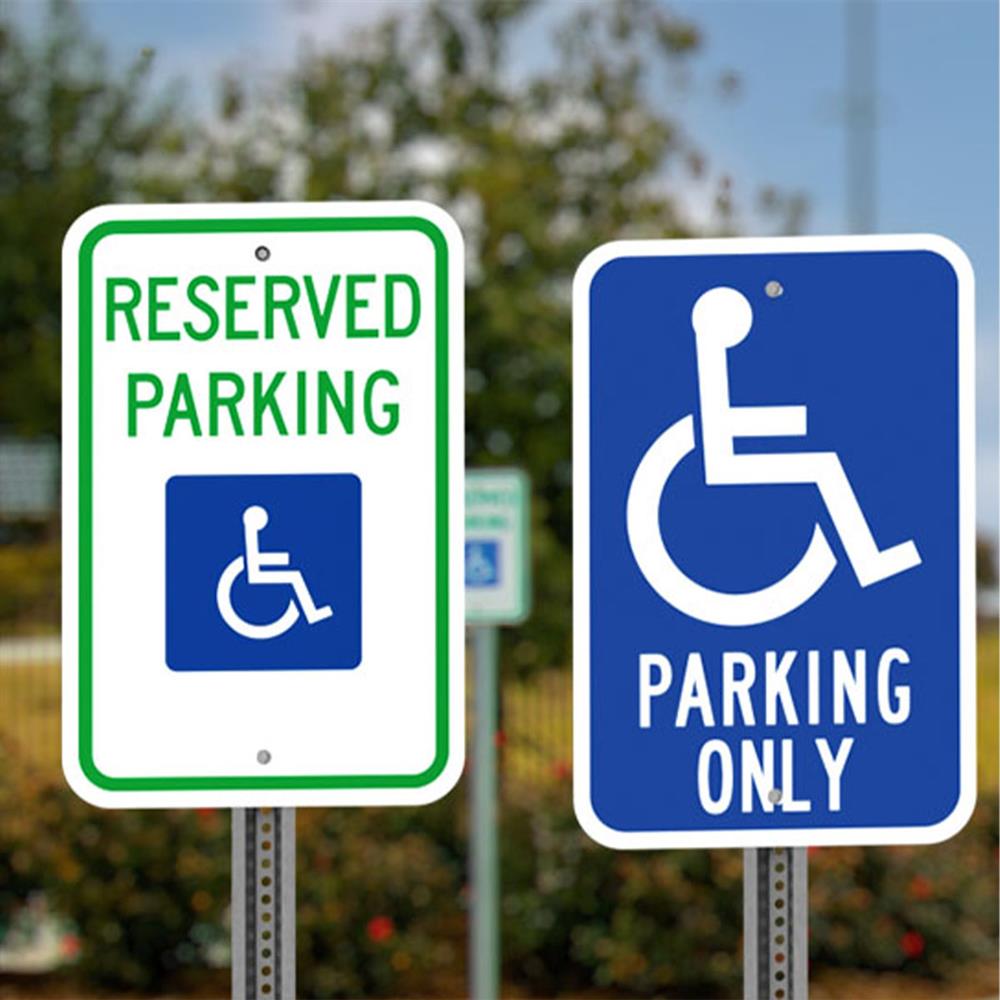
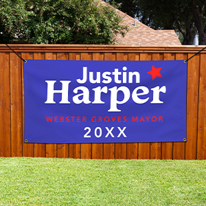
The readability of a sign is often ruined by poor color choices. The Outdoor Advertising Association of America reports that the most visible color combinations in yard signs are white on blue, black on white, black on yellow and yellow on black. Keep in mind which of these high-contrast color combinations match your target audience and use them to increase the visibility of your custom signs. Another sign design trick is drawing attention to important information like a phone number or web site by using a different font color. Be careful to go beyond three colors, as it may be harder to read and more distracting.
Find Simplicity in Design
When designing custom signs, it is important to follow a similar design that matches your other promotional and marketing material. Keeping colors and fonts the same helps customers remember your brand, making them more likely to come back for repeat business. It may seem dull to follow this sign design tip and tempting to add new fonts and colors for variety, but consistency is key to driving your message home. Using these sign design tips along with your business goals will help draw more traffic and sales to your business, so keep them handy when creating your next batch of custom signs.


